


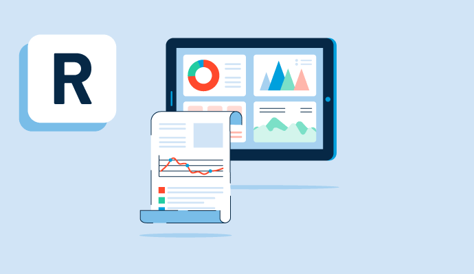
What are reports and dashboards?
Reports and dashboards are often discussed together, and both present information visually to company leaders to help make data-driven decisions. However, reports and dashboards are two different business intelligence tools.
A report offers an in-depth look at a single element of business performance. Based on specific criteria, a report provides data in chart form. This data can then be sorted, grouped, or filtered. A report is often static, providing a snapshot of a topic at a particular time.
A dashboard provides an at-a-glance overview of the most crucial metrics and trends for a business. A single dashboard consists of several data visualization elements, like different graphs, charts, and details, often relating to a unified theme. As a whole, a dashboard can offer a dynamic glimpse into how well a business is doing overall. Each individual visual on the dashboard connects to a more in-depth report.
Many organizations use data visualization software and dashboard software as part of a business intelligence suite to create customized reports and dashboards. These tools can translate data and metrics into charts and graphs to help companies track business metrics and key performance indicators (KPIs) in real time.


Types of reports and dashboards
Depending on its needs, an organization may use one or more types of dashboards. There are four main types commonly used. These types include:
- Strategic: Upper-level executives use strategic dashboards to monitor KPIs. Executives view these dashboards daily to make sure the company is on track to meet long-term strategic goals. Typical metrics on this type of dashboard include fiscal performance and growth rates.
- Operational: Operational dashboards have shorter-term goals. They are used by lower-level management to monitor real-time progress. Example metrics on this type of dashboard include follower count and website bounce rate.
- Analytical: Help support company executives and mid-level management. These dashboards provide a comprehensive look at huge amounts of data to identify trends. Typical metrics include annual contract value or company spending habits.
-
Tactical: Help users, often mid-level management, analyze progress toward goals. These dashboards allow users to dig deeply into data and consider how to use that data to drive future decisions.
There are also a number of different reports that can be run, depending on the specific type of software used. Three common formats are:
- Tabular: Essentially a table or list of data. For example, this type can be used for generating a list of potential clients.
- Matrix: Looks like a grid and can be used to tabulate data across rows and columns. This is useful for summarizing two different data types, such as product quality and units sold.
- Summary: Useful when a company is looking to present subtotals. It is similar to a tabular report but allows for the grouping of rows. A company might use this format when looking at sales per sales rep.
Within each format, there are also sub-types of reports, leading to a long list of possible options. Reports can also be created from scratch and fully customized.
Basic elements of reports and dashboards
While reports and dashboards are two different tools, they share many basic elements in common. The basic elements of reports and dashboards include:
- Data
- Tables
- Charts
- Graphs
- Visuals
- Sharing options
- Filters
- Exports to printing
- Storage in folders
Benefits of using reports and dashboards
By allowing individuals to make data-driven decisions, reports and dashboards have a number of benefits for all types of companies. For example, they:
- Help businesses organize data into manageable groups or sets.
- Offer insights into how a company is performing in key areas at any time.
- Save time and money by automating data presentation, organization, and report creation.
- Reduce stress by providing users with a customizable view of data, hiding unnecessary information.
- Provide flexibility by allowing users to sort and filter data by project or keyword.
- Guide decision-making processes by allowing executives to monitor trends and act accordingly.
Reports and dashboards best practices
To convey data efficiently and effectively, it is essential to consider best practices when setting up reports and dashboards. A company should stick to the following guidelines:
- Consider the audience. Think about who will see the dashboard or the report. Then, add only the data or metrics that are most relevant for those users.
- Think about the purpose. When creating a dashboard, choose the data or metrics that are most aligned with the company’s goals. Be intentional and select only information that serves an important role in company decisions.
- Keep it clean. Just like on a desktop, too much visual clutter on a dashboard can be distracting. Avoid using large amounts of text or data, and use graphics when possible.
- Keep it symmetrical. Consider organizing the dashboard using a grid view, which is symmetrical and appealing. Place similar metrics near each other to create logical cohesion.
- Use filters. Dashboard filters allow users to limit the scope of the data on the dashboard. Save time by using dashboard filters before sending reports to recipients with different roles or needs. Similarly, reports can be filtered to only show the most relevant fields or data.

Kelly Fiorini
Kelly Fiorini is a freelance writer for G2. After ten years as a teacher, Kelly now creates content for mostly B2B SaaS clients. In her free time, she’s usually reading, spilling coffee, walking her dogs, and trying to keep her plants alive. Kelly received her Bachelor of Arts in English from the University of Notre Dame and her Master of Arts in Teaching from the University of Louisville.


")
")


